Sales Analysis: measures, groupings and the two filters that are already on
What this does
Sales Analysis is the one report behind every sales number in WindoorERP. It reads order lines — not orders — and lets you pivot them by salesperson, customer, product, category, team, country or month, in a graph, a pivot table, a list or a form.
The three other entries under Reporting are this same report with a grouping already applied. Learn this screen and you have learned all four.
Before you start
- Know that a row here is an order line. An order with eight openings contributes eight rows, so counting rows counts lines, not deals.
- Two filters are already applied when the screen opens, and they change every number you see. Read the next section before trusting a total.
- Sections and notes are excluded. Only lines carrying a product reach the report, so a quotation's headings never inflate the count.
Steps
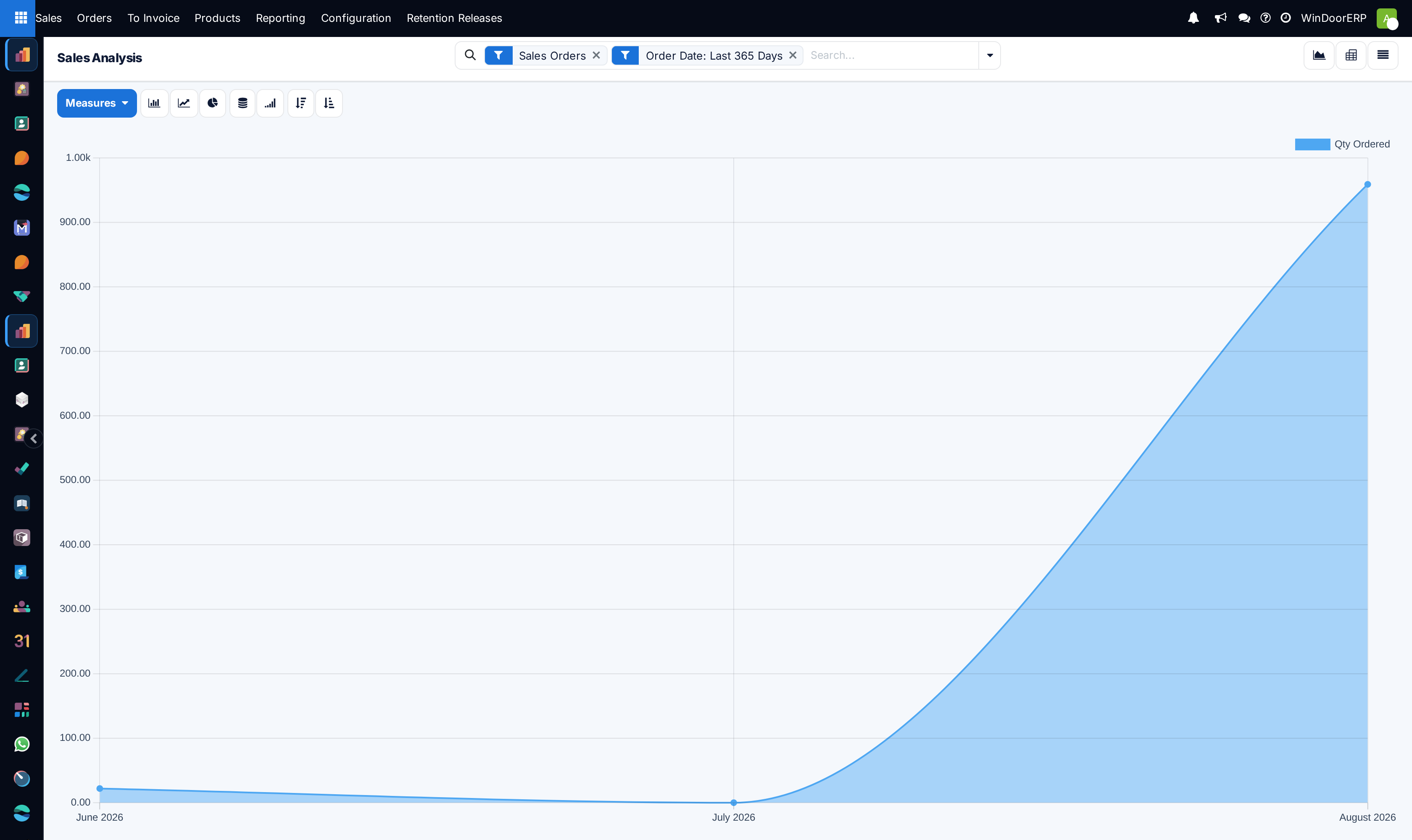
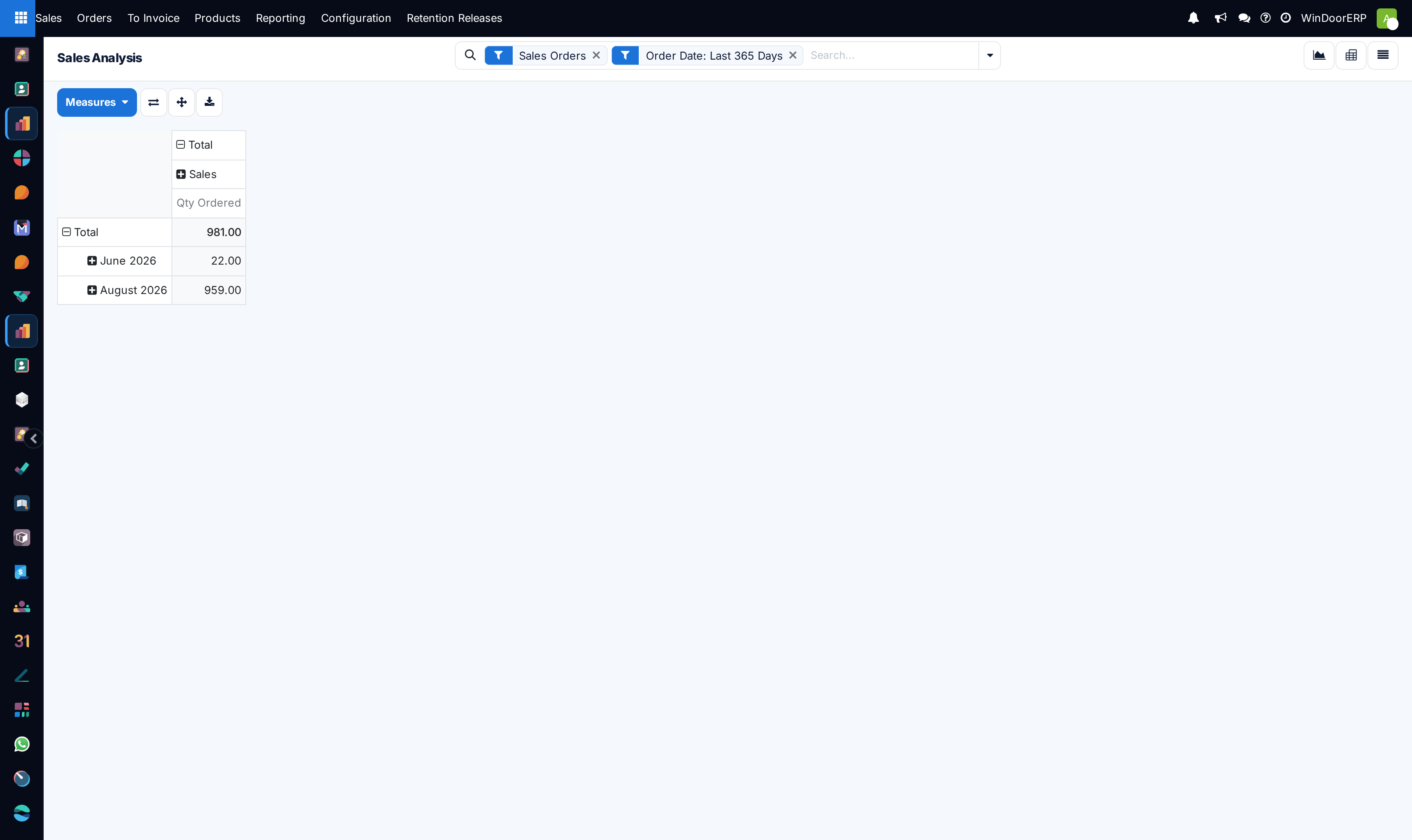
The two facets that are already on when you arrive
Sales Orders restricts the report to confirmed orders — quotations, sent quotations and cancelled orders are all excluded. So this screen answers "what did we sell", not "what did we offer". To see quotations, remove the facet and apply Quotations instead.
Order Date: Last 365 Days cuts everything older than a year. It is the usual reason a total here does not match a total someone quoted from elsewhere. Remove it for a full history.
Neither is hidden — both sit in the search bar with an × — but both are easy to read past, and neither is mentioned anywhere on the screen.
-
01
Open Sales › Reporting › Sales.
-
02
Look at the two facets in the search bar before anything else: Sales Orders and Order Date: Last 365 Days. Both can be removed with their ×.
-
03
Set the Measures you actually want. The graph opens on Qty Ordered, so the first chart you see is quantities, not money.
-
04
Group the data from the search dropdown — Salesperson, Customer, Product, Product Category, Sales Team, Status, Order Date.
-
05
Switch views with the three buttons at the top right: graph, pivot, list.
-
06
In the pivot, use the arrows to flip rows and columns, the cross to expand everything, and the download button to take it into a spreadsheet.
The measures
| Qty Ordered | The default. Quantity in the line's own unit, so a report mixing units adds square metres to pieces. Group by product or unit before trusting a quantity total. |
|---|---|
| Qty Delivered / Qty Invoiced | What has actually shipped and been billed. On fabricated lines delivery only moves on the finished-goods delivery after production, so this lags the order by weeks by design. |
| Qty To Deliver / Qty To Invoice | The outstanding remainder of each. |
| Untaxed Total | The revenue measure most reports want. This is what to switch to first. |
| Total | Including tax. |
| Untaxed Amount Invoiced / To Invoice | Revenue split by what has been billed and what has not — the basis of a collection view. |
| Discount % / Discount Amount | Only meaningful where line discounts are enabled. |
| Unit Price | Averages badly across mixed products; use it grouped by a single product. |
| Volume / Gross Weight | From the product records. Empty unless products carry them. |
| # of Lines | A row count, useful as a sanity check against the others. |
Grouping and filtering
The group-by list is where the four Reporting menus differ: Salesperson, Sales Team, Customer, Customer Country, Customer Industry, Product, Product Variant, Product Category, Status, Company and Order Date. Any two can be combined, which is how you get revenue by salesperson by month in one table.
Beyond the two defaults, the filters offer Quotations, Sales Orders, a free Date period, To Invoice and Fully Invoiced.
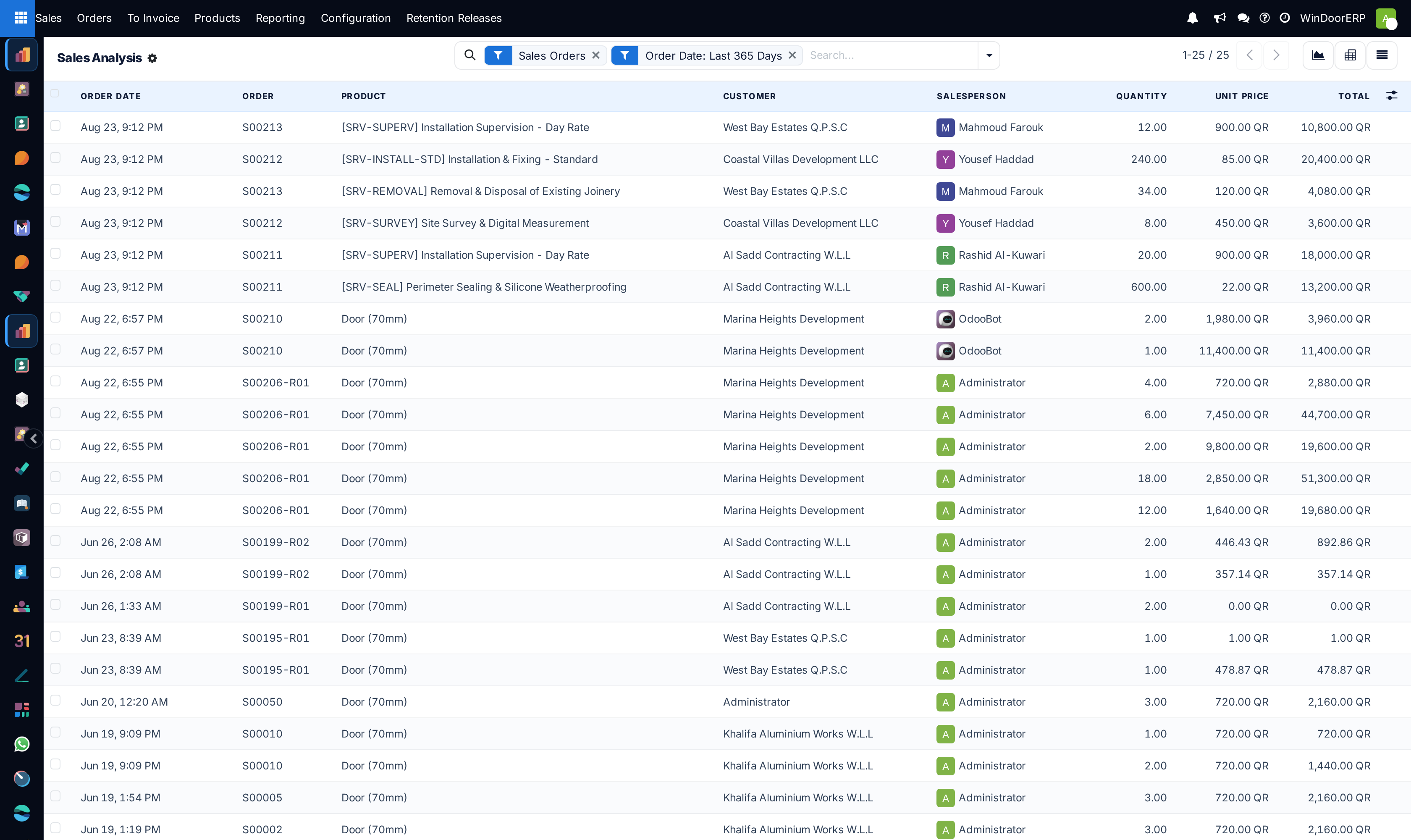
The four Reporting menus
| Sales | Sales Analysis with no grouping. Graph, pivot, list and form. |
|---|---|
| Salespersons | The same report grouped by salesperson. Graph and pivot only. |
| Products | Grouped by product. Graph and pivot only. |
| Customers | Grouped by customer. Graph and pivot only. |
There is no difference in the data, the measures or the filters — only in which grouping is applied before you arrive, and in the three having no list view. Anything one can show, the others can, by changing the grouping.
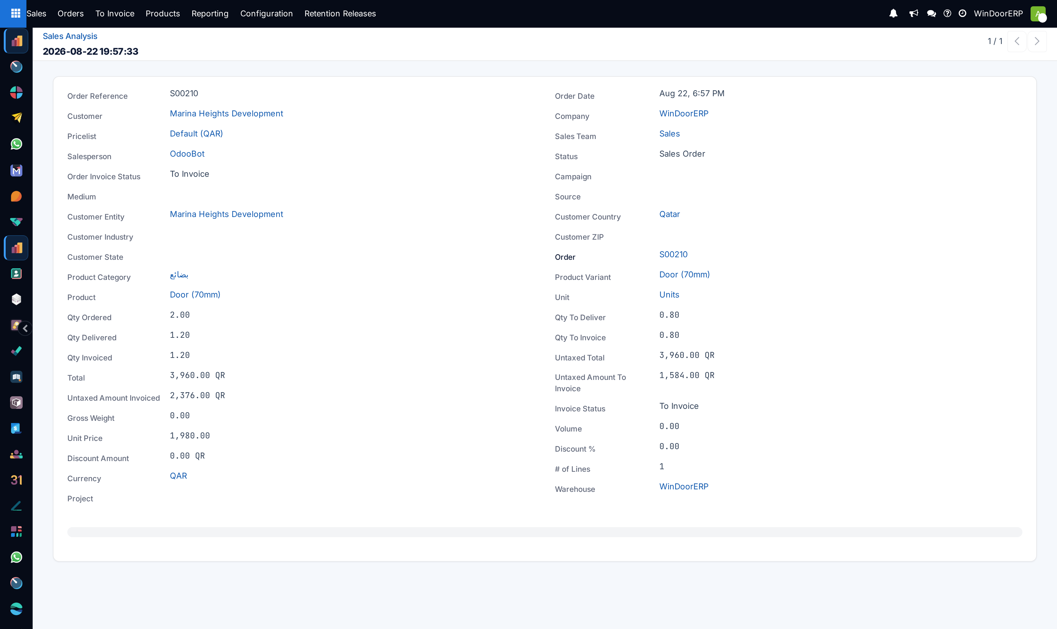
Troubleshooting
| The total is lower than expected | Almost always the 365-day facet, or the Sales Orders facet excluding quotations. Remove them and compare. |
|---|---|
| The chart is in the wrong units | The default measure is Qty Ordered, not revenue. Switch to Untaxed Total. |
| A quantity total looks absurd | Units are being added across different units of measure. Group by product or by unit. |
| Delivered is far behind ordered | Expected for fabricated work — those units are delivered from production, not from stock at confirmation. |
| The numbers disagree with an invoice report | This report is built on order lines. Invoicing has its own reports, and progressive billing deliberately does not track the order line one-for-one. |
Common mistakes
- Quoting a figure from here without saying which filters were on. The two defaults make almost every raw total ambiguous.
- Reading row counts as deal counts. Rows are lines.
- Comparing a quantity across products measured in different units.
- Treating the three grouped menus as different reports and re-deriving the same numbers four times.
Was this article helpful?
Thanks — your feedback helps.
Running a window or door factory?
Ask for a demo