Analyse stock moves and their values
What this does
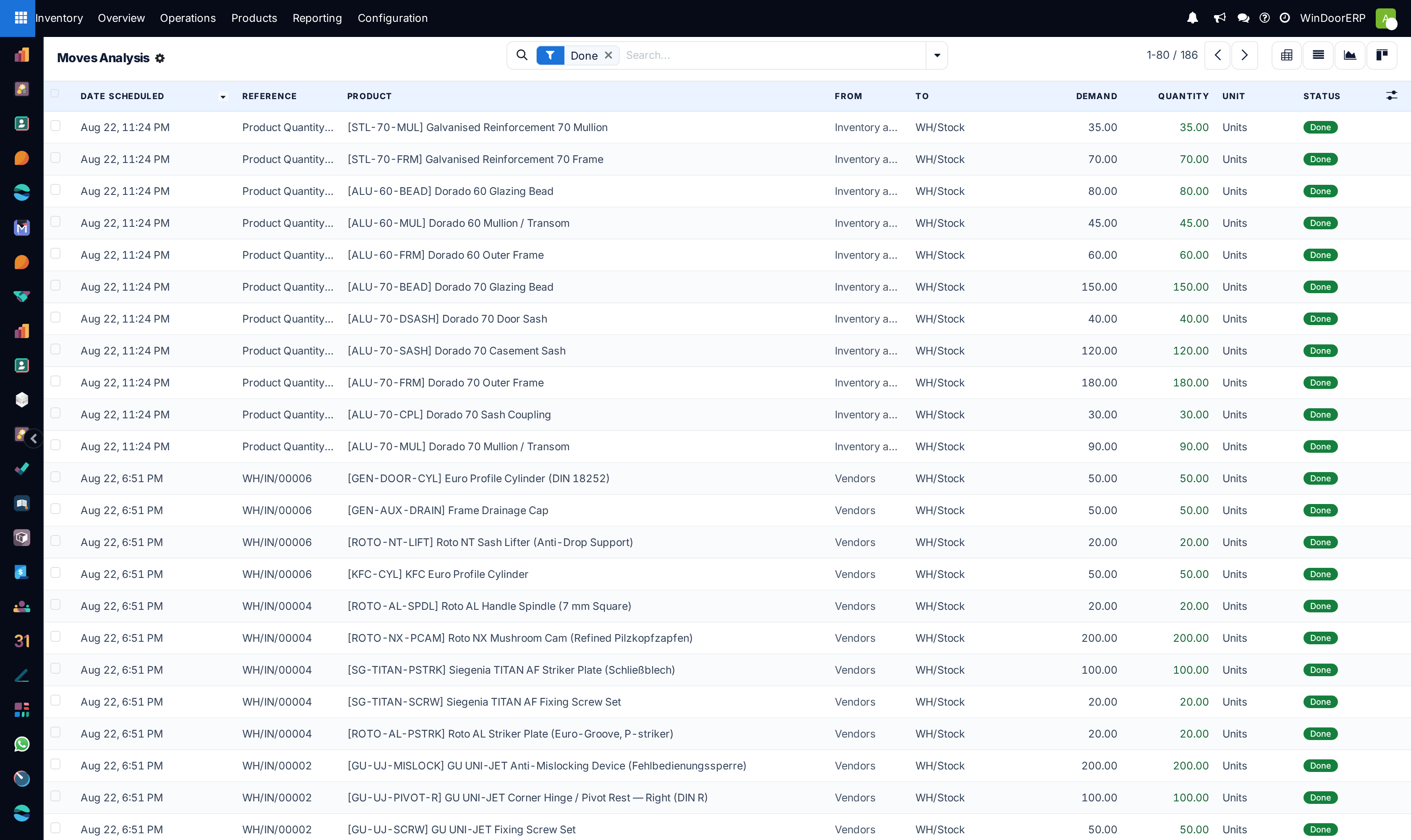
Moves Analysis lists the stock moves themselves — demand against quantity actually moved — and is the one reporting screen that can show a move's value. Use it when the question is about consumption and cost rather than about tracing one product's history.
See also
To follow a single product's journey through the warehouse, use Trace every movement of a product, which covers Moves History — the screen with the pivot view and the per-unit detail.
Before you start
- Know the difference between the two reporting screens: Moves History is one row per physical movement of units; Moves Analysis is one row per planned move, carrying both what was asked for and what happened.
- Both open filtered to Done. That is deliberate — draft and cancelled moves are not consumption.
Steps
-
01
Open Inventory › Reporting › Moves Analysis.
-
02
Leave the Done filter in place for historical figures, or swap it for Ready or To Do to look forward instead.
-
03
Use the column selector at the right of the header to switch on Value — it is hidden by default and is the reason to be on this screen.
-
04
Group by product, category or date to compare periods, and read Demand against Quantity to see where the two diverge.
-
05
Click any row to jump to the transfer, scrap or document behind it.
What the columns mean
| Column | What it tells you |
|---|---|
| Demand | What the move asked for, with a total across the list. |
| Quantity | What actually moved — red when leaving your stock, green when entering. A gap against Demand is a short pick or a partial receipt. |
| Value (hidden by default) | The cost value of the move. No other reporting screen offers it. |
| Remaining Qty / Remaining Value (hidden) | What is left of an incoming layer that outgoing moves have not consumed yet — the raw material behind valuation. |
| Date | Turns red when the move is overdue and not done. |
| Status | Draft, ready, done or cancelled. |
Note
Moves Analysis is a list and a form — there is no pivot or graph view here. When you need to cross-tabulate quantities by category and month, use the pivot on Moves History instead, and accept that it carries no value column. The two screens each hold half of what a full analysis wants.
Reading consumption honestly
Fabricated work reaches this screen as ordinary moves: raw profile and glass leaving stock, finished units arriving from production. So a month's consumption is readable here, but it is consumption of materials, not a production report — how production consumes and produces stock is documented in Launch production from a sales order.
Troubleshooting
| Symptom | Cause and fix |
|---|---|
| There is no pivot or graph button | Correct — this screen has none. Use Moves History for the pivot. |
| No Value column | It is hidden by default. Switch it on from the column selector at the right of the header row. |
| Totals look too low | The default Done filter excludes everything not yet completed. Clear it if you want the pipeline too. |
| You cannot create a move here | By design — moves are created by transfers, scraps and adjustments, not typed into a report. |
| A red row you did not expect | Red quantities are stock leaving an internal location. Follow the reference to see which document caused it. |
Common mistakes
- Mixing draft and done moves into one "consumption" figure.
- Looking for value on Moves History, which has no value column, and concluding the data is missing.
- Reading Demand as what happened. Demand is the request; Quantity is the fact.
Was this article helpful?
Thanks — your feedback helps.
Running a window or door factory?
Ask for a demo