Analyse order lines in the pivot and the chart: which measures mean what you think
What this does
The same screen as Audit every order line in one list — Sales › Orders › Sales Orders Lines — has two more views behind the switcher at the top right: a pivot and a graph. Switching to them changes the question. The list answers "what is on this line"; the pivot and the graph answer "how much of it is there, cut which way".
This is the only place in the Sales app where you can total lines. Sales Analysis totals orders, and the Orders queues total whole order values; neither can tell you how many square metres of a profile series were sold, or which item code is repeatedly delivered short. That is a line question, and this is the line data.
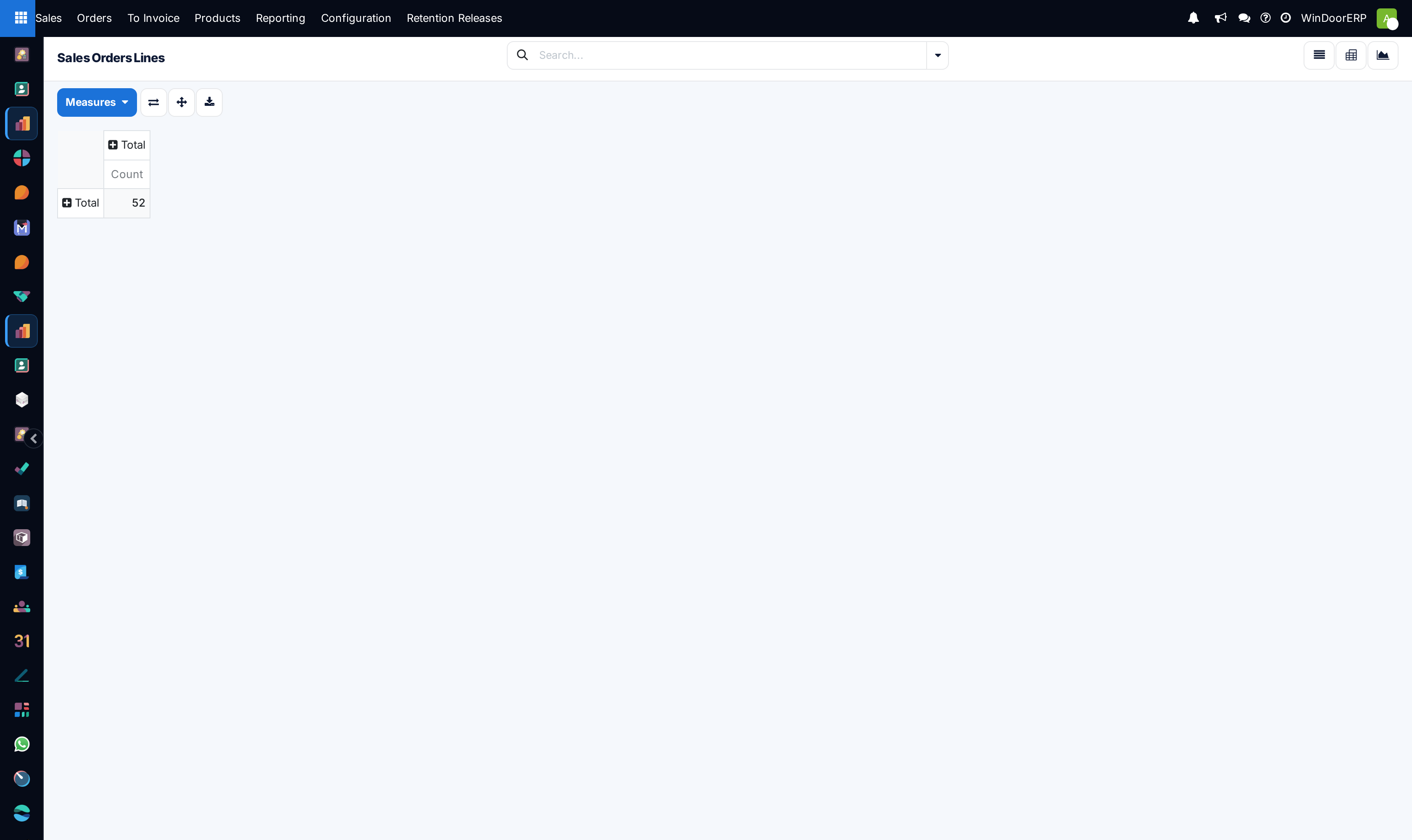
It also opens completely empty of any analysis, which surprises people. Nothing is grouped and the only measure is a row count, because no pivot layout is defined for this screen — the software generates a blank one. Everything below is what you build on top of that blank.
Before you start
- The action carries no filter. Draft quotations, sent quotations, confirmed orders and cancelled orders are all counted together. Group by Order State before you believe any number, or filter down to what you meant.
- Pick the measure deliberately. The default is a count of lines, which is almost never the figure anyone wanted.
- There is no Margin measure and no Cost measure. The margin module is not installed on this system, so profitability cannot be built here at all.
- Read the list article first if you have not: what a column means there is what a measure means here.
Steps
-
01
Open Sales › Orders › Sales Orders Lines and click the pivot icon (the grid) or the graph icon (the chart) at the top right.
-
02
Open Measures and turn off Count unless you want it, then turn on what you are measuring — Subtotal for untaxed money, Quantity, Delivery Quantity, Invoiced Quantity, Quantity To Invoice.
-
03
Group the rows: click the ➕ on the Total row header and choose a field. Product, Order, Salesperson, Order State, Invoice Status and UoM are offered; anything else on the line is available from the Custom Group picker.
-
04
Group the columns the same way from the ➕ on the Total column header — Order State across the top and Product Category down the side is a good first look.
-
05
Click any cell to drop out of the pivot into the lines that made it. That is the check that keeps this screen honest.
-
06
Use Download xlsx when the figure has to leave the system, so the export carries the grouping you actually applied.
What the pivot gives you
Four controls sit above the table, and the figure above shows all of them:
| Control | What it does |
|---|---|
| Measures | The list of things that can be added up: every numeric field on the line in alphabetical order, with Count always last. Thirty entries in all, and Count is the one that is on when you arrive. |
| Flip axis | Swaps your row grouping with your column grouping. Faster than rebuilding the table when the shape came out the wrong way round. |
| Expand all | Opens every group at every level at once. |
| Download xlsx | Exports the table as you have built it, groupings and measures included. |
Grouping is done on the table itself, not in a side panel: the ➕ beside Total on the left edge opens the row grouping, the ➕ beside Total along the top opens the column grouping, and each expanded group can be expanded again by a second field, so three levels deep is normal work.
Which measures to trust
Thirty entries in the Measures menu is more rope than most people want. These are the ones that mean what you think:
| Measure | What it totals |
|---|---|
| Count | Number of order lines. Useful for "how many items", never for "how much". |
| Quantity | Ordered quantity. Only add it up within one unit of measure — group by UoM as well, or you are summing pieces and square metres together. |
| Delivery Quantity | What has actually gone out, across the whole selection. |
| Invoiced Quantity | What has been billed. |
| Quantity To Invoice | The gap between what is billable and what is billed. This is the closest thing on this screen to a backlog figure. |
| Subtotal | Line money excluding tax. On this system this is the same figure the list shows in its Amount column, and it is the measure to use for revenue. |
| Total | Line money including tax. Correct for a receivables conversation, wrong for a revenue one — and the two names are close enough to swap by accident. |
| Untaxed Invoiced Amount / Untaxed Amount To Invoice | The billed and not-yet-billed halves of the untaxed value, per line. |
| Area (m²), Width (W), Height (H) | The opening dimensions carried on the line. Area is the one worth totalling — square metres sold by profile series or by customer is a genuine fenestration figure. Adding up widths and heights is not. |
| Surveyed Qty / Remaining Qty | What site survey has confirmed, and what is left to survey. |
And these are the traps, all of them offered in the same menu with no warning:
- Discount (%), Profit Margin %, Overhead % — percentages, and the pivot adds them up. Ten lines at 5% report 50%. Profit Margin % is worse than useless here: it is a number somebody may type on a line, it defaults to zero, and nothing computes or checks it.
- Unit Price, Original Unit Price, Technical Price Unit, Price Reduce Tax excl, Price Reduce Tax incl — rates, not amounts. A sum of unit prices is a number with no meaning.
- Labor Cost — computed from a placeholder formula with a fixed complexity factor. It is not a costing, and it must not be presented as one.
- Design System Amount, Sill Height (mm), Lead Time, Design Version, Time Remaining on SO — real fields, but summing them answers nothing.
The list's Amount column is not in the Measures menu
The list shows a column called Amount that follows the company's tax setting. It is worked out on the fly and is not stored, so the pivot cannot total it and it does not appear among the measures. Use Subtotal: with this company's tax-excluded pricing the two are the same number.
Grouping that actually earns its keep
Six group-bys are ready in the menu — Product, Order, Salesperson, Order State, Invoice Status and UoM. The Custom Group picker adds around a hundred more, every groupable field on the line. The ones worth knowing about:
| Group by | What it tells you |
|---|---|
| Product Category | Aggregates through the product to its category, so goods and services separate cleanly even though the category is not a column on the line. |
| Customer | Line-level totals per customer — the cut Sales Analysis gives you only at order level. |
| Order State | The safety group. Put it across the columns and every other figure in the table is instantly readable as committed or not. |
| Invoice Status | Splits the selection into Nothing to Invoice, To Invoice, Fully Invoiced and Upselling Opportunity. |
| Code | The workshop item code. Group by it to find the same window repeated across contracts. |
| Design Color, Profile Name, Glass Name | The specification fields the line carries. They are typed rather than picked from a catalogue on most lines, so treat a spelling variant as a different group and expect a long tail. |
| Warehouse, Company | Only interesting where more than one exists. |
| Created on, Last Updated on, Design Last Modified | The only three dates the line carries. There is no order date here — a period cut has to come from the order's own reporting. |
The graph
The graph icon shows the same aggregation as a chart. It opens as a single bar labelled Total, for the same reason the pivot opens as one cell: nothing is grouped and the measure is Count. It becomes useful the moment you group it.
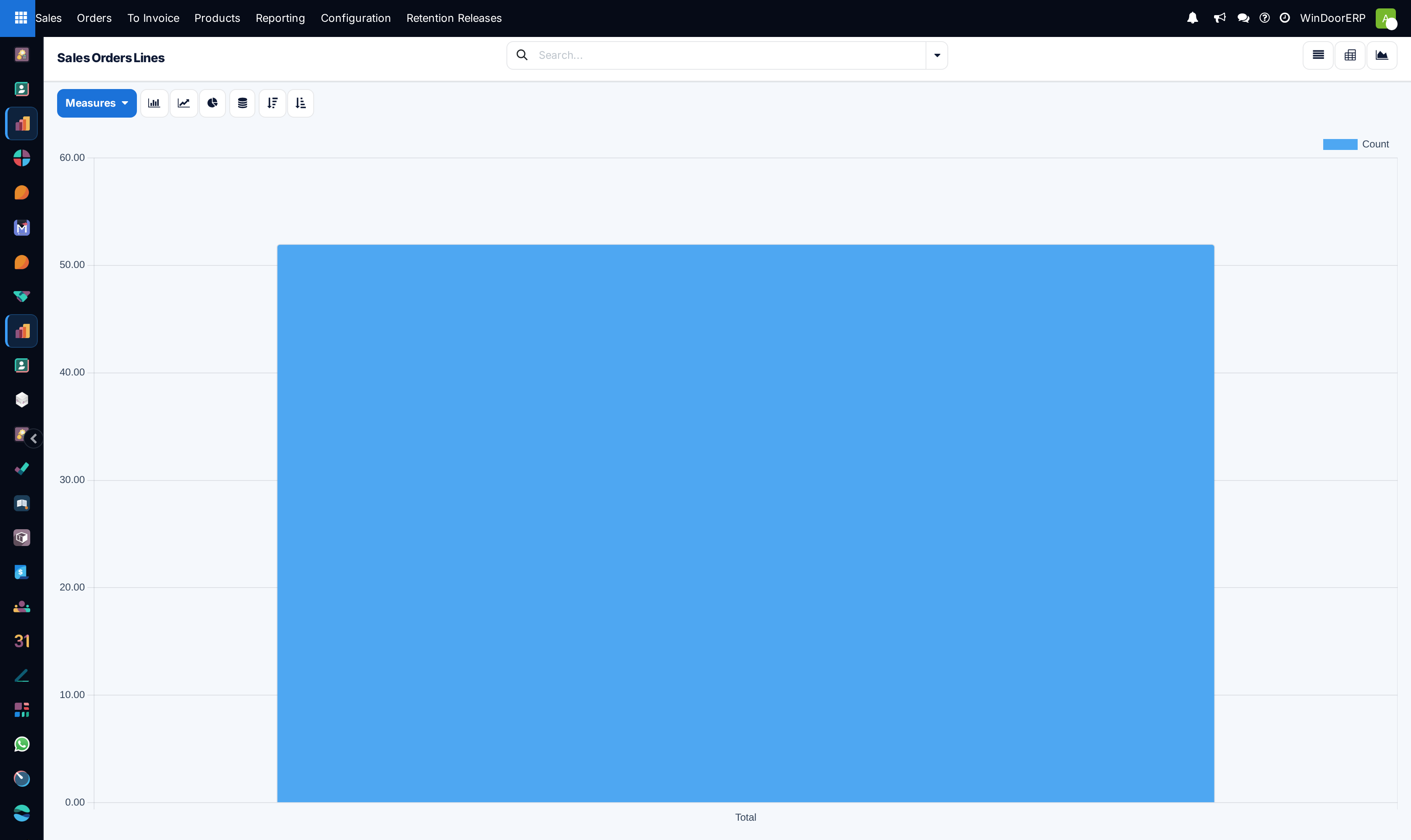
The controls beside Measures are Bar Chart, Line Chart and Pie Chart, a Stacked toggle for a bar chart grouped two ways, and Descending and Ascending to sort the bars by value. The graph carries one measure at a time — a second one has to be read in the pivot.
Troubleshooting
| What you see | Why, and what to do |
|---|---|
| One cell, one number, nothing else | That is how it opens. Nothing is grouped and the measure is Count. Add a row grouping from the ➕ beside Total. |
| The total is far higher than the sales figure you expected | Cancelled and draft lines are in the selection — the screen has no filter of its own. Group by Order State, or filter. |
| Two revenue figures that differ by a fixed proportion | One of them is Total and the other Subtotal. The difference is tax. |
| The number does not match Sales Analysis | Different model and different rules. Sales Analysis works on orders and applies filters of its own; this screen applies none. They are not meant to agree — see Sales Analysis: measures, groupings and the two filters that are already on. |
| No Margin in the Measures menu | The margin module is not installed. There is nothing to enable. |
| You cannot group by month | The line carries no order date — only Created on, Last Updated on and Design Last Modified. For period analysis, use the Sales Reporting menu. |
| "Pie chart cannot mix positive and negative numbers. Try to change your domain to only display positive results" | Your selection contains negative lines — a credit, a rate revision downwards. Filter them out or use a bar chart. |
| A percentage measure adds up to something impossible | It is doing exactly what you asked. Percentages cannot be summed; take them out of the measure list. |
Common mistakes
- Publishing a figure from this screen without grouping by Order State first, so quotations that were never won are counted as sales.
- Reporting Total as revenue. It includes tax; Subtotal is the revenue measure.
- Adding up Quantity across mixed units of measure.
- Presenting Profit Margin % or Labor Cost as costing. One is hand-typed and usually zero, the other is a placeholder formula.
- Comparing this screen's totals with Sales Analysis and concluding one of them is broken.
- Exporting the xlsx before setting the grouping, and sending out a spreadsheet with one number in it.
Was this article helpful?
Thanks — your feedback helps.
Running a window or door factory?
Ask for a demo