Analyse after-sales workload and history
What this does
Two views of the after-sales workload: a live control-tower dashboard for what is happening now, and an Analysis report over every service order ever raised, for the questions that need history.
Before you start
- The two surfaces answer different questions and are filtered differently — mixing them up is the main way people get contradictory numbers.
- What you see may be scoped to your own work: a technician sees their own orders where a manager sees the department's.
Steps
-
01
Open After-Sales › Dashboard for the current picture, and set its date range.
-
02
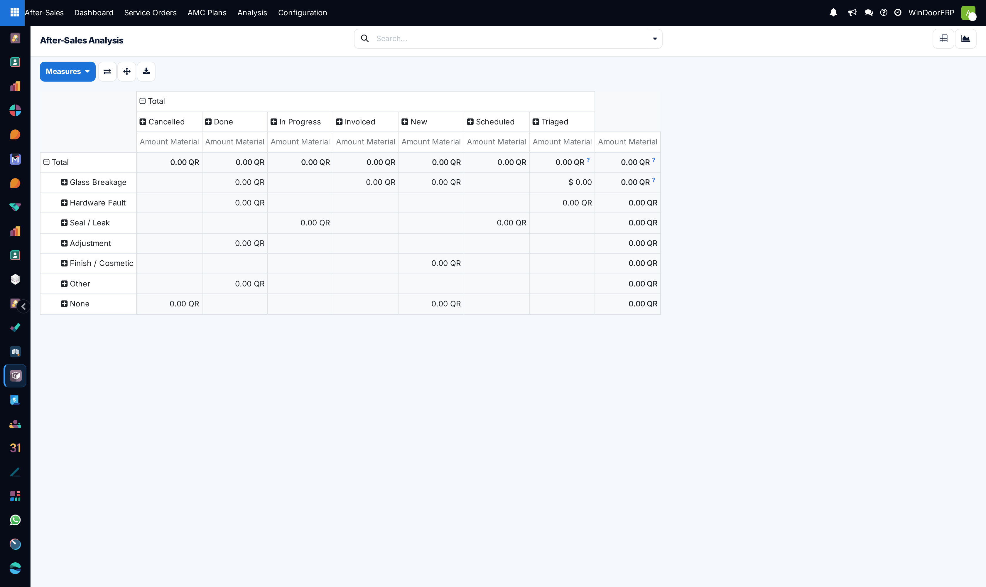
Open After-Sales › Analysis for history — it opens as a pivot of service category against state.
-
03
Change the measure or the grouping to ask your own question, and switch to the graph view for the shape of it.
-
04
Drill from any cell into the underlying orders when a number looks wrong.
Dashboard versus Analysis
| Dashboard | Analysis | |
|---|---|---|
| Question | What is happening now? | What has happened across the whole history? |
| Scope | The date range you pick | Everything — all states, all time, no default filter |
| Includes closed & cancelled? | Within range | Yes, always |
| Opens as | Live cards and charts | Pivot (category × state), with a graph view alongside |
Important
Analysis is unfiltered by design: it includes cancelled orders and everything from the beginning of the database. The service-order list, by contrast, shows open work only. Two people quoting "how many service orders" from those two screens will always disagree — say which surface a figure came from.
Reading the category pivot
The default pivot puts service category down the side and state across the top, so one glance shows both what kind of work you get and where it accumulates. A category with a heavy New or Triaged column is a queue problem; one heavy in Done but light in Closed is an administrative tail, not a technical one.
The measure it opens on is the material amount on the orders — useful for "what are we spending parts on", not for counting visits. Switch the measure to a count when the question is workload rather than cost.
Troubleshooting
| Symptom | Cause and fix |
|---|---|
| Analysis totals are much larger than the Service Orders list | Correct: Analysis includes closed and cancelled orders across all time; the list shows open work. |
| Two people see different dashboard numbers | The dashboard scopes to what each viewer is responsible for. Compare the same role before concluding it is broken. |
| The pivot is full of zeros | You are measuring material amount on orders that consumed no parts. Switch to a count measure. |
| A category is missing entirely | No orders carry it yet — categories appear as they are used, not as they are configured. |
Common mistakes
- Quoting a figure without saying whether it came from the dashboard or from Analysis.
- Counting cancelled orders as work done because Analysis includes them.
- Measuring team workload with a money measure.
- Treating Invoiced in these reports as revenue — it means a quotation was created, nothing more.
Was this article helpful?
Thanks — your feedback helps.
Running a window or door factory?
Ask for a demo